Art prints are a popular form of wall art that can add personality and interest to any space. One of the most important factors to consider when choosing art prints for your home is color. Color can have a powerful impact on the mood and atmosphere of a room, so it’s important to choose art prints that complement your existing decor.
Here are some tips for choosing art prints that work well with the color scheme of your space:
Contents
- 1 1. Consider the dominant colors in your room
- 2 2. Look for complementary colors
- 3 3. Think about the mood you want to create
- 4 4. Use color to add contrast
- 5 5. Choose art prints with multiple colors.
- 6 6. Consider the frame color
- 7 7. Consider Style as Well as Color
- 8 Final Thought
- 9 You Might Like These
1. Consider the dominant colors in your room
Take a look around your space and note the dominant colors in your decor. This could be the color of your furniture, walls, or accessories. Choose art prints that feature one or more of these colors to create a cohesive look.
2. Look for complementary colors
Complementary colors are colors that are opposite each other on the color wheel, such as blue and orange or yellow and purple. Choosing art prints that feature complementary colors can create a bold and dynamic look in your space.
3. Think about the mood you want to create
Different colors can evoke different moods and emotions. For example, blue is calming and serene, while red is energizing and passionate. Consider the mood you want to create in your space and choose art prints that reflect that mood.
4. Use color to add contrast
If your decor is mostly neutral, consider choosing art prints that feature bright or bold colors to add contrast and interest to your space. Similarly, if your decor is already colorful, choose art prints with more muted colors to create balance.
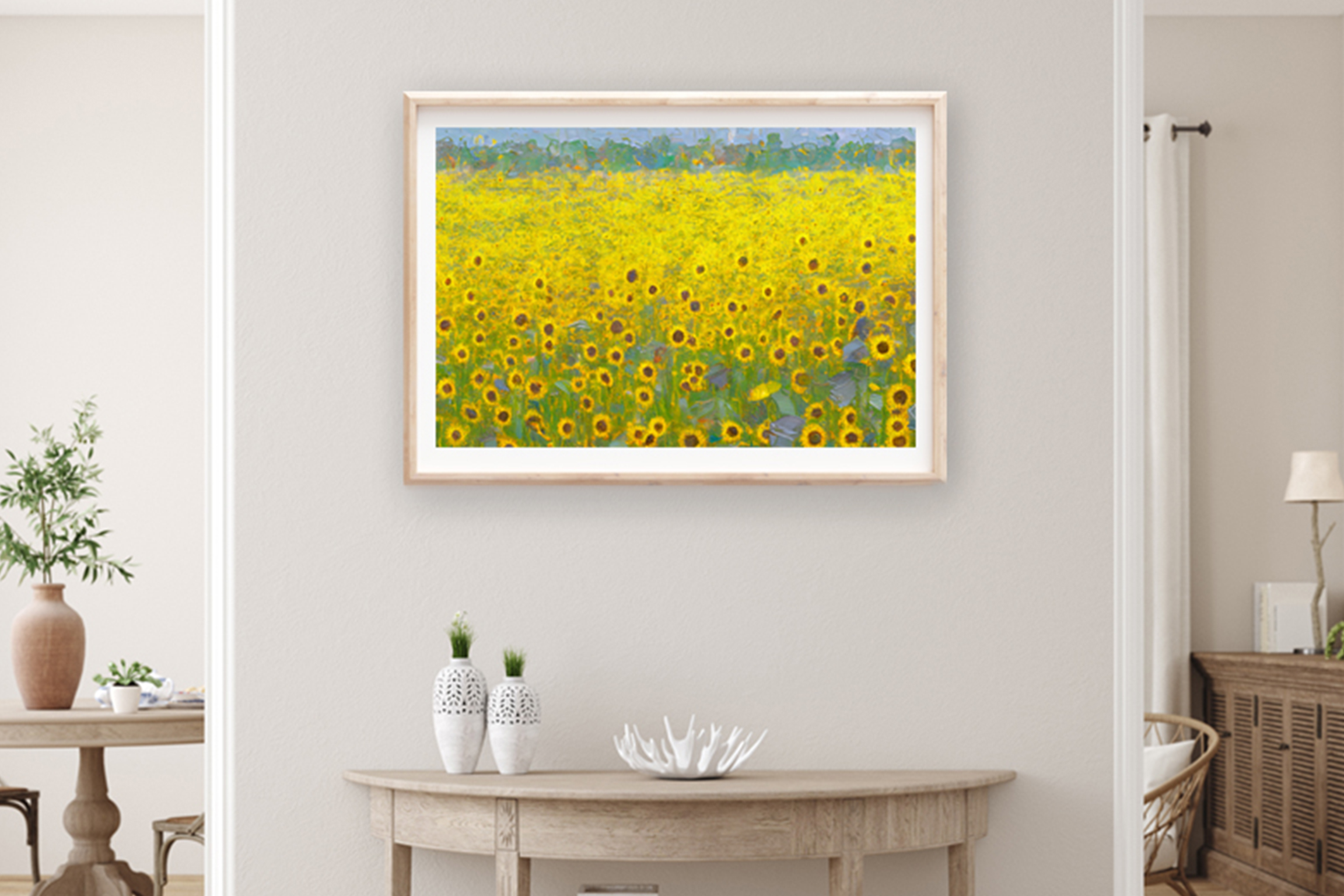
5. Choose art prints with multiple colors.
Art prints that feature multiple colors can work well in a room with a neutral color scheme. The different colors in the print can add interest and dimension to your space.
6. Consider the frame color
The color of the frame can also have an impact on how well an art print complements your decor. Choose a frame color that matches or complements the colors in your space.
When it comes to choosing art prints, there are a few things to keep in mind in order to create a cohesive look that complements your existing decor. By considering the dominant colors in your room, looking for complementary colors, thinking about the mood you want to create, using color to add contrast, choosing art prints with multiple colors, and considering the frame color, you can choose art prints that enhance the overall look and feel of your space.
7. Consider Style as Well as Color
In addition to choosing art prints based on color, it’s also important to consider the style of the art itself. For example, a modern abstract print might not work well in a traditional space, while a vintage botanical print might not fit in a modern interior. By considering both color and style, you can choose art prints that not only complement your decor, but also reflect your personal taste and style.
When it comes to displaying art prints, there are many options to choose from. You might choose to hang a single large print as a focal point in your room, or create a gallery wall with a collection of smaller prints. You might also choose to mix and match different styles and colors of art prints to create a unique and eclectic look.
Final Thought
Ultimately, choosing art prints that complement your decor is all about finding the right balance between color, style, and personal taste. By considering these factors and taking the time to choose art prints that you truly love, you can create a space that feels both beautiful and personal.
Besides buying physical print, you can also consider buying and downloading digital art print. You can print it at home, take it to your local print shop, or upload it to an online printing service to have it printed on canvas or other materials. Therefore there are many benefits to download digital art print for wall decoration. This flexibility allows you to choose the size and style that best fits your needs and decor.
[ux_text text_align=”center”]